
This is a step by step tutorial for the tools in ADEPTUS. First,from the menu you can access the tutorial, main, and download pages at any time. You can also contact us, and our team at ACGT.

ADEPTUS offers three types of analysis:
This page allows different enrichments on an input gene list as gene symbols. You can also present the gene list as a network. The gene list input can be given by filling the box or by upload a “.txt” file. The genes can be separate by space, comma, tab or new-line (“Enter”).
Gene Ontology Enrichment – we use TANGO, a tool for analysis of the GO hierarchy, see Expander.
Pathway Enrichment – we use Fisher’s exact test with FDR correction. For example, when we run the enrichment on this list {TP53, BRCA1, BRCA2}, the result table:
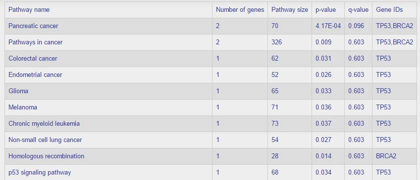
The table is ordered by the q-values, from low (most significant) to high.
Disease ontology enrichment – In this enrichment we test the gene list against the diseases that pass our statistical analyses. The test checks if the gene list has unusual ranks in our pre-computed gene scores for each disease. The analysis is similar to GSEA but the input is reversed: the gene ranking is kept fixed and the user provides the gene list.
View gene network – This option will present a network based on the genes as nodes, and the edges between (Genemania PPI by default). More about the graph page in the Analyze a disease or tissue part.
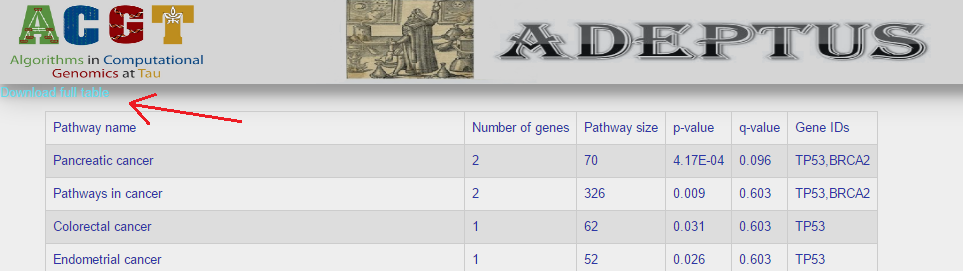
All the enrichment results can be downloaded as a txt summary table:
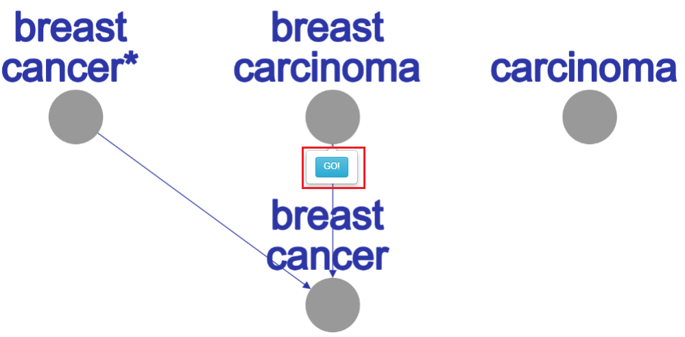
This option will lead you to tree-like graph (DAG) of our well classified diseases labels. Each disease is represented by a node, and the edges represent “is a” relations. This graph is active:
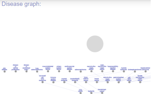
Example - click on the graph area
At the left side of the page there is a bar with “choose” options:
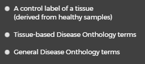
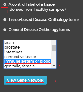
Choosing the first label – “A control label of tissue” (1) will open new window below with list of tissues, by choosing one of them(2) and pressing on the “View Gene Network”(3) button beneath it, you will get a network visualization of the genes in that control term.
The second option – “Tissue-based Disease Ontology terms” will also open a new window with a list of tissues below. This time, selecting a tissue and clicking on the button will produce a visualization of the relevant disease labels:
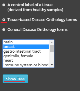
This tree contains all the well classified disease labels for the selected tissue. In the label network, left mouse-click on disease node will pop up a balloon with “GO!” button for moving to the label’s gene network.
Well classified diseases for breast tissue
By choosing the third option – “General Disease Ontology terms” and click on the “Show Tree” button we also will get new tree at the right side of the page, this tree contain the non-tissue well classified diseases. At this tree, again, left mouse-click on disease node will pop up the “GO!” button balloon, and by clicking on him we will get the relevant network graph.
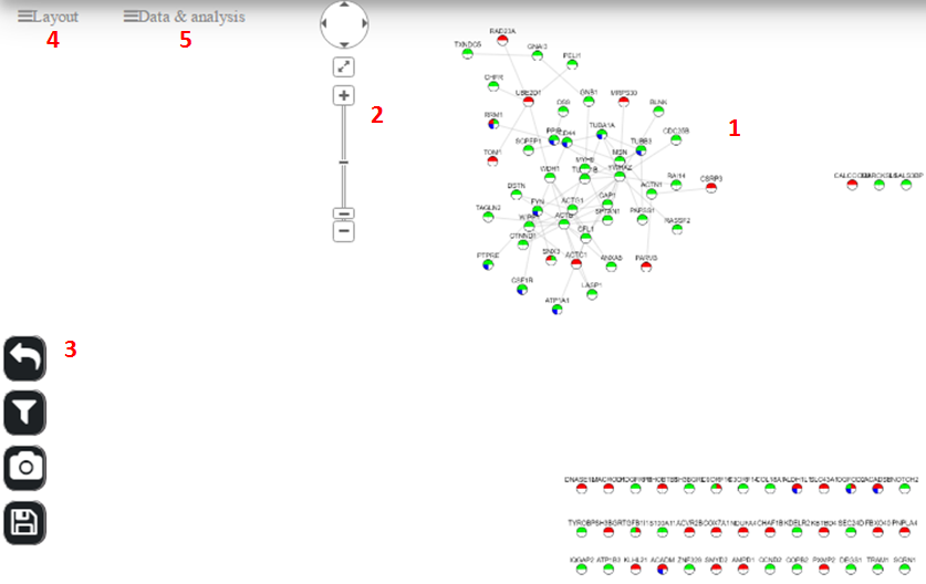
Graph page
This page is the result of each disease query. Also, we can get into this page from “Analyze a gene list” → “View Gene Network” for user given gene list. The graph page contains many options:
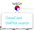
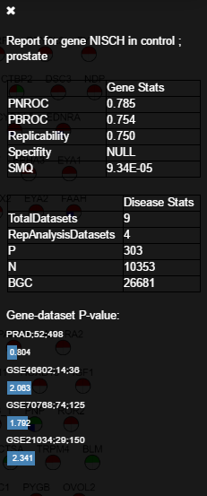
Gene report: a meta-analysis on the gene’s information in the database. Here a new bar will slide into the right side of the page. The bar title will show the gene and the label (e.g., “Report for gene NISCH in control; prostate”). After that, there are two tables. The first one includes the gene’s scores of our univariate analysis (e.g., ROC scores). The second table gives the statistics of the label in the database. Finally, we give a bar plot that shows the -log10 p-values of the specific gene in all datasets that were used in the label’s analysis. This table can be used for meta-analysis or replicability analysis for the query gene.
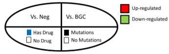
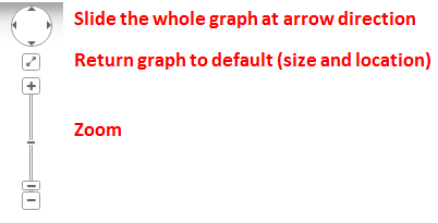
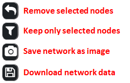
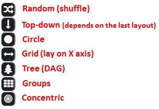
Graph control:
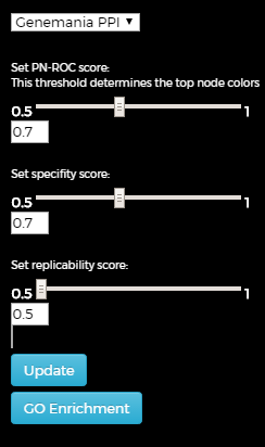
Brief terminology of the gene scores (see the paper for more details):
There are two different options.
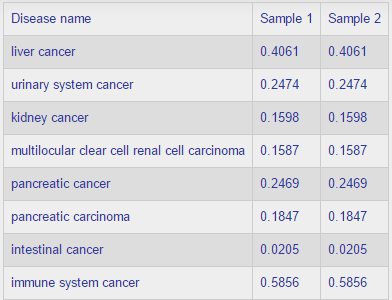
The result table shows the predictions as probabilities for association between cancer subtypes (rows) and samples (columns). Here is an example: